

オンラインストア
サービス予約
イベント
ポップアップ
SlickShift Before After Slider
開発元:
NextGen Before & After Photo Slider
まだレビューはありません
30日間無料お試し

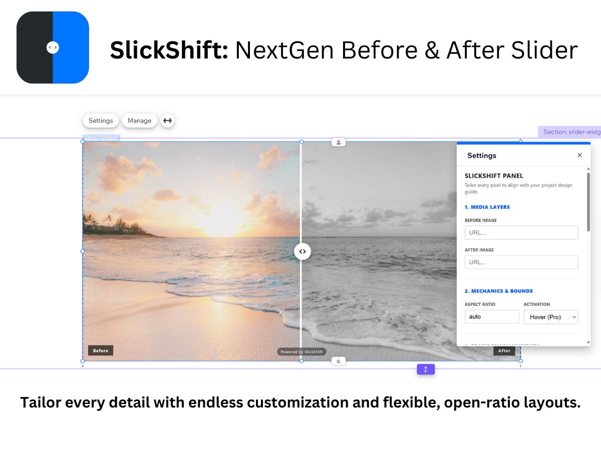
SlickShift Before After Slider の概要
- Fluid & Responsive Layouts for All Builders
- NextGen Hover-to-Reveal Interaction Mode
- Case-Sensitive Custom Text Banner Labels
- Deep Customization: Borders, Colors & Fonts
評価・レビュー
まだこのアプリのレビューはありません、最初に評価しましょう。料金・プラン
このアプリは、30日間無料トライアルを提供していますSlickShift Proプラン
$
3
99
/月
Unlock Advanced Hover-to-Reveal Mode
Complete Watermark & Branding Removal
100% Fluid Breakpoint Layout Freedom
Priority Developer Email Support
* 価格はUSDです。